
Products should absorb system complexity rather than transfer it to users.
Seven principles, summarized from eight years of designing enterprise tools inside the retail industry — merchandising, pricing, supply chain, stores.
Complexity does not disappear.
It is either absorbed by the product, handled by the team, or pushed onto the user.
My job is to understand the work deeply enough to make that distribution intentional — not to make a complex system merely look simple.
So I care less about whether a screen looks clean in isolation, and more about whether it helps people understand what is happening, decide well, recover when things go wrong, and keep working with confidence.
Understand the work before designing the workflow.
In complex systems the visible task is rarely the real task.
Design should start from that work, not from the surface of the feature request.
Find the user behavior that drives the business outcome.
Business goals and user needs are rarely the same sentence. They are usually connected by one specific behavior.
Leadership framed the problem as forecast accuracy: find unreliable forecasts, watch variance, contain planning risk. Research told a different story about the merchants doing the work.
That distinction split one blurred product need into two: performance monitoring for leadership, and decision support for merchants.
Structure information around the decisions users need to make.
On a merchant KPI dashboard, seven headline metrics and seven basket metrics arrived as fourteen near-identical cards. Primary outcomes, performance drivers and diagnostic indicators all carried the same weight, so every user had to reconstruct the priority themselves.
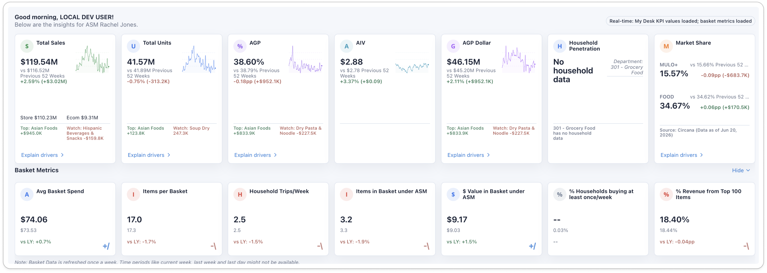
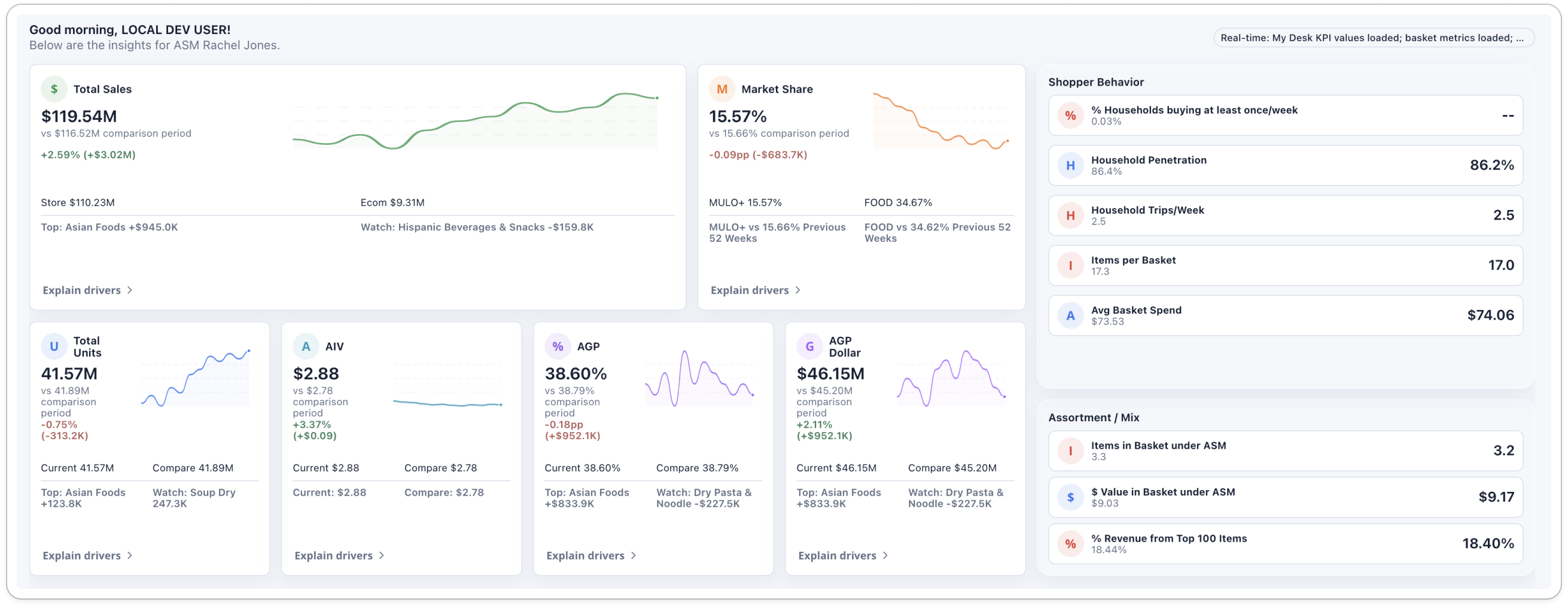
When everything is visually important, nothing is meaningfully prioritized.
Explain the meaning of data, not just its value.
Six related basket metrics, six identical cards, two or three benchmarks inside each. Every number was on screen. The model connecting them — who is buying, how often, how deep each trip runs, and what that is worth per household — was not.
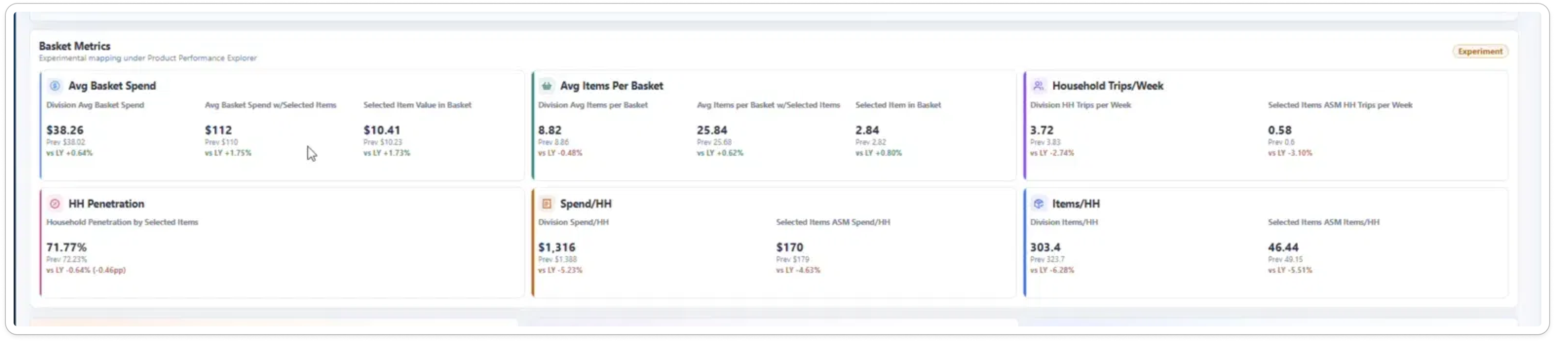
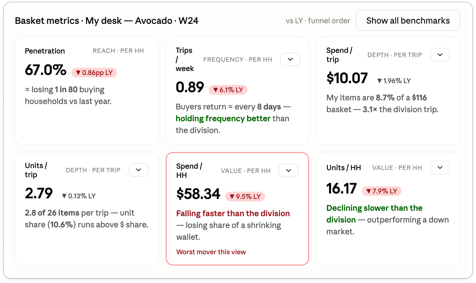
Data should communicate its implication, not merely expose its value.
Preserve the useful behavior, not the pattern's visual metaphor.
The request was to make a hierarchical explorer “feel less like a desktop file browser.” Read literally that is restyling. Read as a task problem, it is a question about what the pattern is actually doing for the user.
- The user's path through the hierarchy stays visible
- Context is maintained across adjacent levels
- Moving back never costs orientation
- The active level and its next step stay in reach
- A permanent equal-width column per level
- Inactive ancestors competing with the task for space
- The look of a file browser
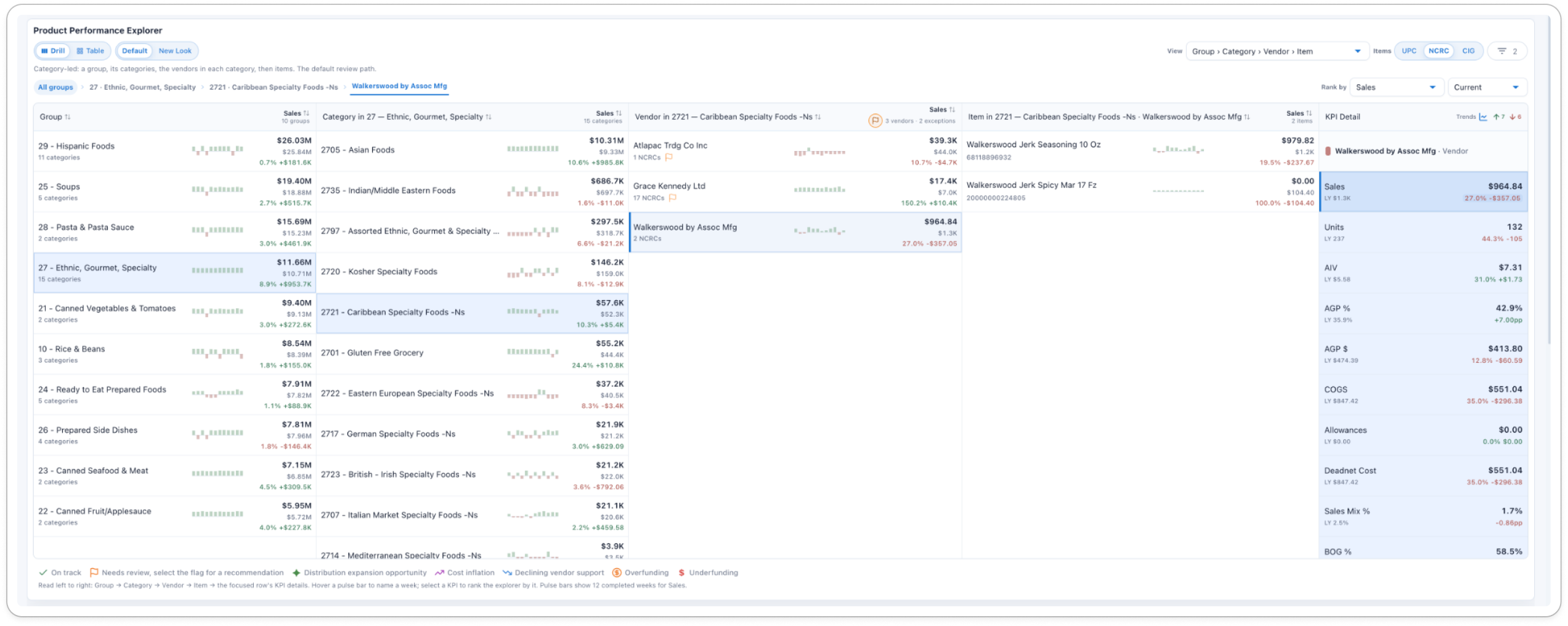
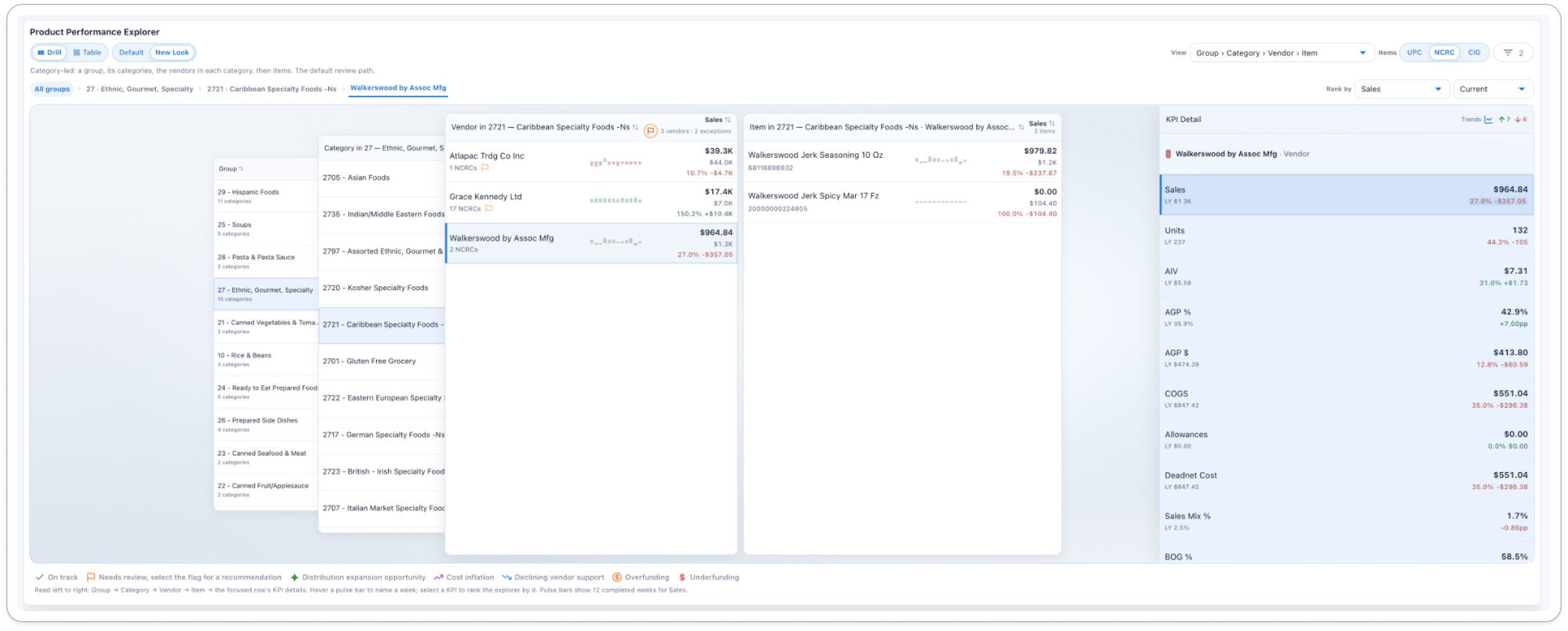
Reuse a pattern for the behavior that supports the task — not because its familiar appearance is easy to copy.
Make system status, consequences, and recovery visible.
Enterprise work runs on partial data, delayed integrations, permissions, approvals, and decisions that are expensive to undo.
Empty, unavailable, error, loading and unsaved-change states are not polish. They are the product's ability to support real work.
Design for exceptions, not only the happy path.
The happy path proves the concept can work. The exceptions decide whether it survives real use.
Methods
Where this comes from: retail operations
Everything above was learned in retail. It is a domain where the product sits inside a large organization, and the people who buy, approve, manage and use it are rarely the same person. These are the constraints I have worked inside:
I can't claim these principles generalize to every industry — I have only practiced them here. But the conditions that produced them are structural rather than retail-specific, so I expect the approach to travel to other operational domains with the same shape.
Much of the work is translation. Ambiguous feedback becomes a specific task, information or decision problem: “this feels too even” is usually an information-priority problem; “make it less like Finder” is usually a request to keep hierarchy behavior while changing the metaphor.
Strong reasoning improves the quality of decisions, but it does not by itself grant a seat in them. So I stay precise about the status of my work — whether I am offering critique, proposing a direction, building the implementation, or owning the decision.
This is the work I care about: connecting business goals to actionable user behavior, making complexity understandable, and helping people act with confidence.